
The project
So what is Kaizen Languages, you must be wondering? It’s the new way of learning a language through Artificial Intelligence. My role was to take control of this complex project from start to finish. Drawing up a plan to manage this project and work closely with every member of the team to perfect every detail. This involved creating a structure for delivering a complete and working app as well as building the company website. I lead all aspects of this project from gathering research, creating workshops for user testing, building analytical data, designing assets, putting together guidelines and drawing up foundations to the core part of the company profile.

A new age of learning
So you want to learn a language?......How hard can it be you ask. Theres many different forms of learning a language, from one on one tutoring, learning through videos or books, or just practicing with a friend. But is there a method of learning a language in a productive way without losing time and can I actually learn in a way that I can practice not bound by a schedule and get feedback instantly.
A.I. takes you through a written curriculum and lets you know when you’ve made a mistake and how to correct it. Our A.I. tutors guide you every step of the way not only by building your conversational skills but by also improving your grammar. You end up feeling like you’re actually speaking to a real person. Your confidence starts to grow and the A.I. takes you on a journey like you’ve never experienced before, not one you can get by sitting in a classroom. In this method there are no distractions, no walls, no judgement. It’s just you and the A.I. and it’s all you need.

So where to start?
As this had never been done before I found myself in a new position, all alone and this was totally a solo act. So, the first thing I had to do is understand the A.I. capabilities, I mean how intelligent is artificial intelligence?! The A.I. is as intelligent as it’s data. Working closely with a colleague who had worked in this field and had vast experience with artificial intelligence, I quickly picked up that the conversation a user was to have with one of the A.I. tutors was all dependent on how extensive the data that was available to them. The data was built from books and knowledge of the translators. In testing this, I would have conversations with colleagues trying to replicate what a user would experience and try to match their expectations.

I also studied different forms of learning and how people remember. How does the brain remember certain words and restore it to memory for later use? In my research a came across a few videos on youtube and learnt about SRS (space repetition learning). This is where you are given a certain amount of words, numbers or characters and they are each presented individually. It automatically keeps presenting you the ones you struggle with and shows you less of the ones you find easy which keeps your brain working as it’s scientifically proven that you remember better once you make a mistake and can recall a word to an image as reference. This became apparently clear with learning Japanese and reading the book, “remembering the Kanji” helped me even further to understand the best methods to help someone learn the most difficult language available to category one speakers such as English.
Creating the style
Looking over the competition I wanted to create a product that stood out from the rest, something in which had not been done before in the EdTech industry that I could find in all my research and trying every educational app and website put there I decided to go with the style below. Blue, the most popular colour online by over 50% would you believe, a gradient style that would bring it to life and a curve that would stand put from all the rest. I especially wanted a font that shouted out strength, clear and easy to read. It had to be a font in which I could use with a large font-family.

Design system & mapping
A design system isn’t only a collection of the assets and components you use to build a digital product. According to Emmet Connolly, director of product design at Intercom, “… most Design Systems are really just Pattern Libraries: a big box of UI Lego pieces that can be assembled in near-infinite ways. When creating UX UI the design system is always at the forefront of my thinking process as well as creating a easy flow to hand to developers. I think about the team as a whole when designing and putting certain structures in place which helps with the process. Below are just some of the decisions made when thinking of the overall picture when it comes to the design system.

User research
Now that I had a strong understanding of my next steps I needed to draw out a plan and find a direction to take this project forward. I downloaded as many language apps as possible, studying them and how they interacted with the user. Even though none of them used A.I. I still was able to find key points such as how they began teaching, the joy users received and why they kept coming back.

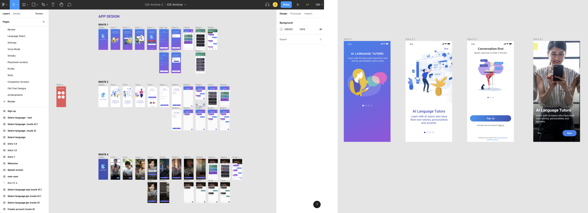
From my research I developed four different style routes from on boarding to starting the first lesson and from this point started to gather intelligence from users as I tested people and how they interacted with the four very different designs. This was a great starting point but it wasn’t enough. So how could I get real users who are actually learning Japanese to test the app and gather real feedback to help me perfect the user experience and design. I went online to find language schools that specialise in Japanese, went to specific places that specialise in Japanese such as meet ups and comic stores which contained manga, the Japanese animated books.
I sent out emails to the WeWork community and stood outside independent classes with designed flyers trying to capture people learning Japanese. I also used online testing platforms such as UserTesting and TrMyUI to name a few. I found these to be not as useful as front facing testers as it was harder to pinpoint genuine testers online. I would go to groups that would get together and chat about their love of learning languages and maybe one day becoming a polyglot. UX Questions

Agile flow
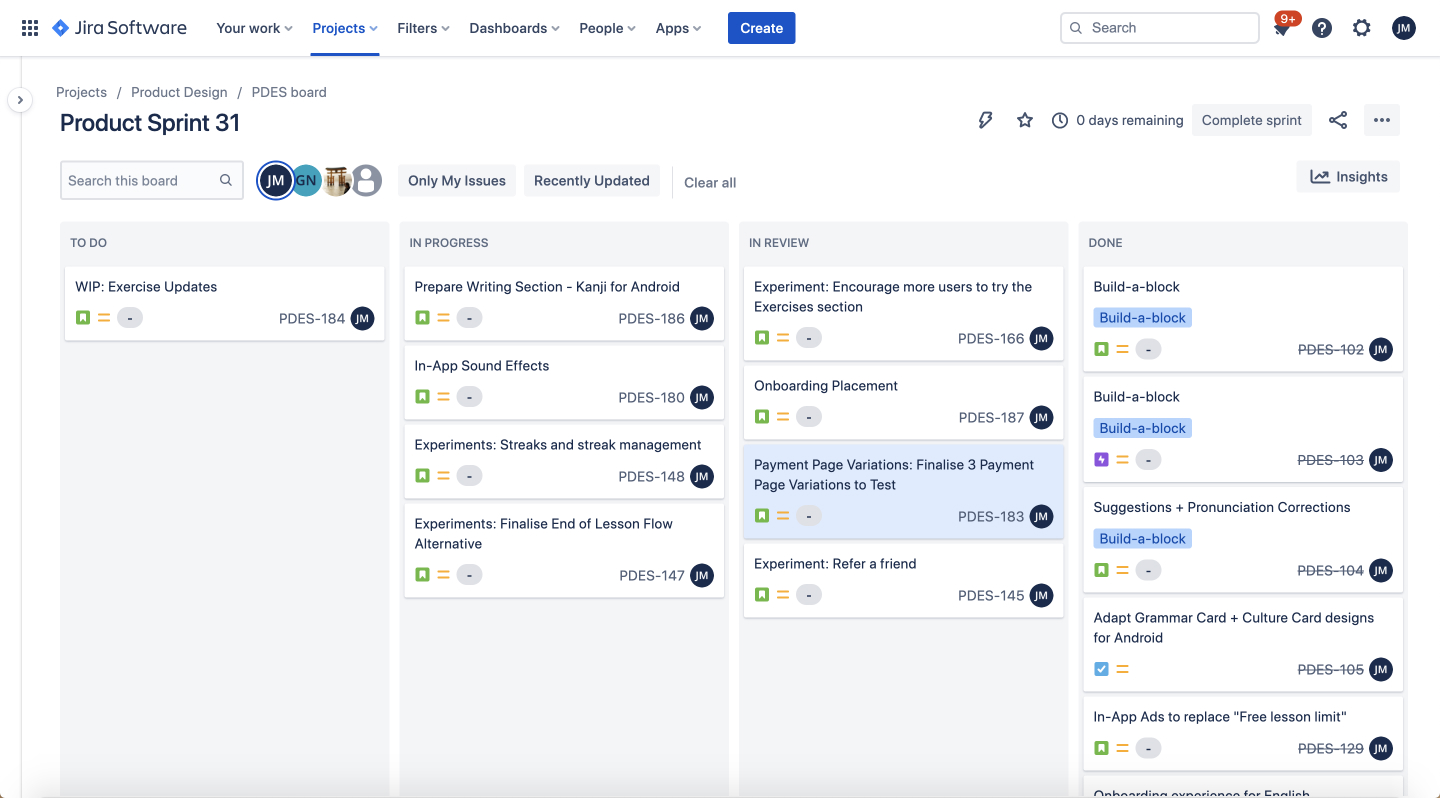
Having an understanding of the teams work process and tasks gives an overall perspectives of the project at hand. It helps us to work in tandem and lend assistance whenever necessary. With this approach we can develop a system which keeps each task in full focus and as the project targets are extreme I found it useful especially when delegating details about each weekly task. We currently use Jira, a tool everyone has found easy and comfortable to use and implement wether to create tickets to report bugs after a round of testing the latest build or to organise their work so we have an understanding as a team that we're moving at a good pace.
Information architecture
I would find myself often having my work displayed on the wall for the whole team to view. It's important to gather everyones insight and thoughts of how we should tackle everyone angle and not to leave any stone unturned. Like this, everyone has a say even if it doesn't develop any further. It is important that we're united every step of the way and the whole team feel they've contributed in all categories and helped achieve the goals. What is great about placing thoughts onto the wall is that we can have some fun with it, tasks don't have to be tedious and the team can get together and lay down their thoughts.


Personas
A deep understanding of a target audience is fundamental to creating exceptional products. User personas help a product team find the answer to one of their most important questions, “Who are we designing for?”
I would visit colleges/schools specifically made for language learning, I would attend meet ups, people getting together over a drink for their love of languages, go to comic stores and what I found from speaking to them is you could put them into pots which breakdown your user base.
What got you into leaning a language? I would watch Manga, I enjoyed the writing system. Fascinated with the country were just few of the answers that helped me understand the user.

User tests
I conducted many user tests and tested our product on different types of testing platforms as I was constrained to a very tight budget especially at the early stages of the product. None was more revealing than the tests of our first builds we had available for testing so I created a few questions and provided the user with the necessary tools. What I discovered was eye opening. Let me give you some context. There are 4 categories in language learning, category 1 is your European languages such as English, French and Spanish, then you have your categories 2 to 4. 4 being the most difficult for someone who speaks a language in category 1. For example, the reason I'm telling you this is because people struggle when pronouncing words that they're not familiar with and this was obvious in our recordings of our user tests using a tool such as UserTesting.com

From the user tests I found that most people struggled to pronounce words that they didn't recognise. I had to think of a way to help a user to pronounce certain words they struggled with. This is where suggestions was born. I introduced another card to the chat lesson as we already had instructions to guide the user, corrections to tell the user they had made a mistake but there wasn't a way of giving the user the extra assistance they needed to get past any corrections. Analytical data showed me that at this stage users started to get frustrated and would leave the app. Suggestion is a help option so that if a user would struggle pronouncing a certain word we would then break that word up into syllables and in a way they could understand each syllable with their speaking language. Let me give you an example. So if you would struggle to say "Hola" then the suggestion would read "O-la". The suggestion also had audio for this word and by holding down the suggestion audio the user would be able to hear the word slowed down 2x.

The way suggestion would work if the user was presented with a correction (error message) twice then the suggestion would pulsate alerting there is help if needed and if clicked the suggestion card would slide across. Click the link above to try the prototype. Another thing I gathered from user tests was users struggled to understand fully the footer icons functions and their purpose from the first iterations to the last. Below are the progress of the character change which users would tap on to change from Romaji, Hiragana and Kanji depending on their level. This was a great success and increased completion rates by 25%.

Wireframes & prototypes
Having a foundation in place to create wireframes is fundamental and I particularly find it easier to create wireframes and prototypes. I would develop a few different types of designs for A/B testing based on research and with Figma mirror it was easy to show them off to the team and use them with the front line of testers.

The use of analytical data
Why do we need data and what use can it have? Having a strong interest in statistics has steered me to use data recording to help improve performance. The business part of the role is very important as I use it to determine certain hypothesis created through research and developing the app through testing so I can get the app to a point at every stage to meet CTA and we use it to measure CHERN, which are customers who return for our services.

The funnels created in firebase allows me to easily monitor the performance on a daily basis. I can look at A/B testing and see if certain methods were better than others and can measure how customers respond to certain features or points within their journey. Hotjar is another tool I have used to measure users experience on our website. With funnels and heat maps I can quickly determine how users respond to certain aspects of the website and with other percentages available to me can see how long they have browsed the site and what was their user journey. This part of the role is just as important as making the products as attractive as possible and user friendly of course. Above we tested users and funnelled them through to have certain amount of lessons for free. We found having only 2 lessons compared to 3 increase the percentage of users subscribing to our premium feature. With the analytical data we found that 3 free lessons resulted in a 1.15% conversion rate but by using only 2 free lessons that increased to 1.3% resulting in an increase of premium customers of 13% it was a fantastic KPI.
Creating the UI
Creating something user friendly takes a lot of effort. An understanding of how a user interprets a product is important and to know how a user thinks adds value to my work, so I often read books to do with the mind such as ‘Don’t make me think’, ‘The design of everyday things’ and ‘Hooked’. I also often watch videos online by ‘Flux’, ‘Cuberto’, ‘Jesse Showalter’, ‘AJ&Smart’ just to name a few. I feel it’s important to keep up to date with the latest trends and I also enjoy expanding my knowledge.

Pinterest is my first stop and I use it often when putting ideas together. As well as looking at competitors, I really enjoy looking at designers work which use platforms such as Dribble and Behance. I looked at many different avenues for a foundation and decided to go with illustrations to tell a story.
Developing a writing method
Before I can write a system to help people learn Japanese which, has a very difficult alphabet as it contains three writing systems which are Hiragana, Katakana and Kanji, I had to learn it for myself. I needed to discover how I take in and soak up all this information which has over 2500 characters, compared to the English alphabet which only contains 26 letters. Not only do you learn what each character sounds like but when they are put together give off a totally different sound. I also had to learn about strokes, radicals and romaji to fully grasp the Japanese language. I also had to keep the user entertained and make them feel like they've actually learnt something worthwhile. This was one of my toughest tasks in this whole project.

So how did we learn the alphabet? We were taught how to write the correct way and a pattern was involved. This pattern helped with our understanding of placement and eye co-ordination writing a character over and over again. I formed a pattern and presented it to the team for testing.

After going through well known methods and reading Genki, the Japanese book used in schools, I was beginning to develop a method I felt would teach users the first steps of understanding the writing system and also making it enjoyable was a major factor. Working closely with the developer we worked out a way in how the stroke order would animate then allowing the user to interact with the stroke themselves, giving them the opportunity to tackle this challenge and be rewarded at the end of the journey. I decided to split up the system into sets as it is in Genki and when I knew it was ready I tested it on our regular testers and found that it was a great success and in fact sometimes it was a struggle to end the test as they found the writing method very addictive which pleased me a lot. By introducing the writing feature to the Kazien app we achieved a Net Promoter Score of 62%, that was 12% above average.

iOS v Android
There are many variable when designing for iOS and Android, each platform has it own unique problems and each with enough complexity to irritate any designer or developer especially on Android with so many types of devices available it was not easy to put these ideas together as I did for iOS. From using SP, DP instead of XP to working on the smallest device to the largest, each phone carried its on problem but it something I enjoy and love to tackle, which are challenges to problems we face everyday as a designer not only on UX but on UI. Working closely with the Android developer, understanding the ration change were one of many issues we tackled as a team and boy did we deliver a great product for all you Android lovers.


New features such as exercises
We faced many problem solving tasks and one of those was to create flashcards. Now flashcards was not something new, in fact it had been seen many times before as it uses the learning system SRS, Spaced repetition is an evidence-based learning technique that is usually performed with flashcards. Newly introduced and more difficult flashcards are shown more frequently, while older and less difficult flashcards are shown less frequently in order to exploit the psychological spacing effect. The use of spaced repetition has been proven to increase the rate of learning.

So the question is how do we make it fun? The idea came from playing cards, so I designed a card within the screen and added the info onto the card, once complete the card would slide to the left revealing the next card underneath. After testing this UX we found it to be very revealing. Not only did it increase retention but also increased conversion. win win! Next steps is not to make more variations of the flashcards such as audio exercises, grammar as well as introducing writing. check out some of the UI below.

Creating illustrations
I created all the illustrations in Figma after drawing up some sketches to show the founders. We worked very close together to achieve targets and stay on track with our goals. I took the route on showing the journey of the app using illustrations a it was a common pattern throughout most, nearly all language apps. It was also something we had tested with users against real life photographs and the founders felt the use of illustrations was the better route plus it was more economically better for the company as a start due to the fact I could do all the illustrations relatively easily in Figma.

Putting the website together
Having experience in building websites and knowledge of coding them using Dreamweaver I put forward the proposal of introducing Webflow and as a backup to my proposal I was able to code the website with my experience so we went from their static Wix website to a more less bounded website using Webflow. It was more economical and that is another reason for the move. With the flexibility I was able to create a website from scratch and take the steps to produce the website as I also created the assets.

Using tools such as Hotjar we were able to monitor user decisions and if we found anything they had complications with as the ultimate goal was for the user to download the app from the website, so it also had to be user ready for mobile view which had over 60% of views compared to the other percentage of users using different devices to view the website. www.kaizenlanguages.com


Social media conversions
The stakeholders and myself had many discussions on how to take the product forward. I remember one of first disagreements was wether to include social media links on the intro screen to allow users to sign up with 1 click option using their favourite social media account. They were not up for that idea which I strongly recommended and heres my finding to why. Social login makes it super simple to sign up for a new product. You reduce friction by providing 1-click sign up rather than having to fill out multiple form fields, put in your email and select yet another password.

It’s no surprise that social login helps lift conversion rates. The numbers vary wildly on exactly how much conversion rates improve—and in addition, much of this data has been provided by social login providers themselves, who are obviously interested parties. However, the numbers generally show an improvement in conversion, and in some cases, very significant increases.
A/B testing
Analytical data is extremely important when dealing with a business product especially with a Saas product. Of course you should focus on the user and their needs but too much to their side and you forget about the business which is the reason why you have customers so there needs to be a balance. One set of a/b testing was the 'most popular' option on the payment screen. By testing a percentage of users, some were exposed to a 3 month option being the 'most popular' option, others to a 6 month option and you be surprised by our findings. By simply moving the 'most popular' sign we were able to increase 6 month subscribers by more than 20%. Not everything needs a huge design overhaul. Sometimes, simply just changing the wording is enough to get results.

Gamification increases retention
Did you know that gamification dramatically increases engagement by 48%! Studies have also found that it has an overwhelmingly positive effect on engagement.n. A survey found that 30% of 500 surveyed business workers inspired them to be more engaged in the workplace. Gamification in education has also seen great results when implemented for students. With 80% of workers in the U.S. finding it to be more effective than traditional training methods, students have also found it to be an integral element. In fact, it has the ability to improve student productivity by as much as 50%.

So the idea was to increase engagement and retention for the product but how? with the introduction of streaks we were able to keep users on for longer and returning every day just to keep up with their streak. You see it everyday when you go for your morning coffee and you present the cashier with your loyalty card for her to stamp. That is a form of a streak where if you keep returning you are rewarded. I wanted to take it further by introducing streak freeze and streak repair. Users can gain these by becoming a Premium user or simply by doing challenges. It's fun and increases engagement.
User empathy
After studying the analytical data we found if a user completed a lesson they were more likely to convert to a paying customer only problem is some users were struggling to complete lessons due to the issues they faced with the mic. Their complaints were mostly that the mic would not pick up what they were saying. So how to resolve this issue? Introducing a skip feature. If a user were stuck at any stage with a minimum of 2 correction the “skip” feature would present itself allowing the user to skip that particular part of the app and carry on with the lesson. We found this to be a good method and drove up conversions. An A/B test was introduced, either a drawer or skip button were presented to see which was preferred. The drawer allowed us to give more detail to user which was always welcomed. check out the working prototype below.

Problem solving
Throughout a user journey there will always be things that will be brought up in analytical data that you may not of anticipated for example we found users would try a lesson once then leave. So how do we encourage users to try different part of the app or maybe the same lesson again. Introducing version 6. Below you'll see a prompt drawer so as soon as a user completes a lesson and returns to the home screen a prompt will animate telling the user to try a different lesson. It could be a lesson that is recommended to them based on their accuracy or errors made on the lesson they have just done. A returning user maybe, or we just want a user to try a different part of the app such as exercises or writing. The data showed us that retention rate would increase if the user did more parts of the app valuing the app more than first impressions may of told them in which created greater users to the subscribe screen. A user would make two connection to an app before purchasing a subscription. Is it worth the money, so value, or an emotional connection. By making changes to version 5 and introducing features such as nudges, multiple options from a carousel and having more interaction in version 6 we were able to increase retention from 1.6% on version 5 to 2.7 on version 6 which resulted in a 70% increase in retention. This opened the door to gamification.


Version improvements
The version 5 was not very interactive. The chat bubbles would just appear from the A.I. tutors. The instructions and option were apart and disconnected. I felt the style wasn’t quite right, there were no assistance for the users when they got stuck at certain stages of a lesson.
In version 6 the A.I. chat bubble would pulsate as if the A.I. were writing to you. (research from other chat apps such as ‘WhatsApp’, ‘FB Messenger’.) I moved the options directly above the instructions card and introduced drawer cards which would appear from the bottom of the screen. (see eg ‘Did you know...’) With more data available to me from the language specialist we were able to introduce grammar information to the user by simply clicking on the purple book in instructions or the purple link. As the lesson became more engaging by using more interaction there was a good improvement in conversations. See chart below.

What our users say

Finished article
You know, some may of found this project far more complex than they had wished for but for me the more challenges and tasks to try and solve, the more linked I am with the project. From understanding how people learn, to working with A.I. this was an exciting project and one I have and still enjoy. The Japanese language is fascinating and full of history with about 50'000 characters from the Chinese languages, it was more than a challenge. I had little interest in Japanese, the only thing that came close was the enjoying of their anime but it's something I don't feel you need to have as a designer because whatever the project, I always put down a sitemap of my journey. Now that I have come to the finished piece which, in fact never ends as we are always looking for perfection which we know doesn't exist, but we will keep going to come as close as possible.

